V CONGRESO INTERNACIONAL DE TIPOGRAFÍA EN VALENCIA
From June 29 until July 1 I was fortunate enough to attend the 5th International Typography Congress, organized by the Designers Association of the Valencian Community (ADCV) - of which I'm a member.
Held every two years, the Valencian Typography Congress is full of exhibitions, conferences, workshops and scientific presentations. Under the name "Beyond Ink" this edition surprised us by showing to all 300 attendees new answers to the technological changes that have driven a revolution in typography.
This edition has brought together, amongst others, distinguished names like Dave Crossland, Dylan Kendle, Petr van Blokland, Hilary Kenna and Gerard Unger.
We also enjoyed presentations from different books and I would in particular like to highlight the book "Cómo crear tipografías" ("How to create fonts"), published by Tipo e. This is a book that I really wanted. The authors, who are descended from different typographic schools (Spanish, Mexican and Argentine), make a sketch of the process of creating a font, from the primary concept to the distribution. The most interesting thing -from the point of view of linguistic unification of Spanish- is that they have joined the differences in typographical terms between different countries.
Apart from this we also enjoyed Chilli Type -presentations and mini-conferences in a relaxed atmosphere and also promising young studios, several tips, or interesting projects such as:
www.familiaplomez.com
www.granadatierrasoñada.es
Apart from the terrible and lamentable rain of ash due to the forest fires that were raging in those days close to the city, I can say it was a wonderful time in which I could reconnect with friends, professionals, old classmates (some of them I have not seen in over 7 years!), teachers, university, etc… I've also been fortunate to meet many wonderful new people with whom to share the passion for letters.
They were a great few days off, sun, beach and good company with whom I could even have some typographic fun by covering eachother up in type tatoos (French Clarendon Ornamented to be more precise, for more information: www.woodtyperevival.com), or doing an installation at the door of the conference venue.
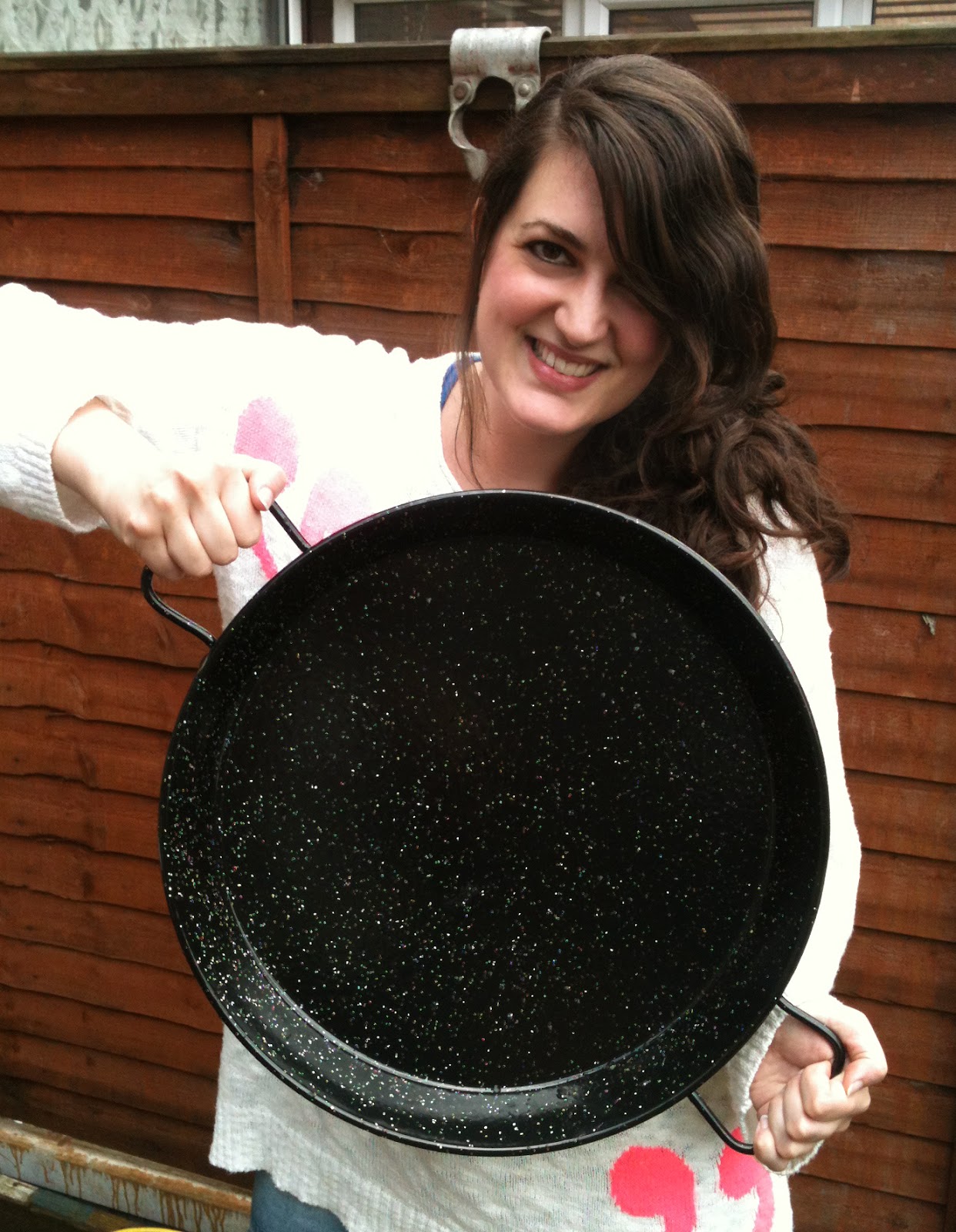
To top it off and using my trip as an excuse, I bought a paella-pan to bring it with me to London. Great meals await..!
If you want to read some information in English about the International Typography Congress talks you can read it in the following link (by the great Dave Crossland):
understandingfonts.com/blog/2012/06/congresotipografia-day
Official pics:
www.flickr.com/photos/congresotipografia
♦
En pasado 29 de junio hasta el 1 de julio tuve la suerte de asistir en Valencia al V Congreso Internacional de Tipografía, organizado por la Asociación de Diseñadores de la Comunidad Valenciana (ADCV) de la que formo parte.vimeo.com/monografica/v-congreso-internacional-tipografia-valencia
Como cada dos años el Congreso está repleto de exposiciones, conferencias, talleres y ponencias científicas. Con el nombre "Más allá de la tinta" esta edición trataba de mostrar a los 300 asistentes nuevas respuestas ante los cambios tecnológicos que han impulsado una auténtica revolución en el ámbito tipográfico, estudiando el papel que desempeña la tipografía en un contexto “donde Internet domina el panorama de la información y la comunicación”.
Entre los conferenciantes han sobresalido nombres como los de Dave Crossland (asesor de Google Fonts y al frente del proyecto de fuentes libres Open Font Library), Dylan Kendle (Tomato),
Petr Van Blokland (Buró Petr van Blokland + Claudia Mens - www.petr.net), Hilary Kenna (www.type4screen.com) y Gerard Unger (www.gerardunger.com)
También pudimos disfrutar de presentaciones de diferentes libros, a destacar el libro "Cómo crear tipografías", de la editorial independiente Tipo e. Este es un libro al que tenía muchas ganas, sus autores descendientes de escuelas tipográficas diferentes (Española, Mejicana y Argentina) hacen un recorrido por todo el proceso de creación de una tipografía: desde el concepto más primario hasta su distribución. Lo más interesante, desde el punto de vista de una unificación lingüística del español es que han aunado las diferencias de los términos tipográficos existentes entre los diferentes países.
A parte de esto también pudimos disfrutar de los Chilli Type, presentaciones y mini-conferencias en un ambiente distendido. Jóvenes promesas, consejos varios, o proyectos interesantes como:
www.familiaplomez.com
www.granadatierrasoñada.es
A parte de la terrible y lamentable lluvia de ceniza por los incendios sufridos en esos días cerca de la ciudad puedo decir que han sido unos días maravillosos en los que he podido reencontrarme con amigos, profesionales, antiguos compañeros de estudios (¡algunos a los que no veía hace más de 7 años!), profesores, escuela, etc. Además he tenido la suerte de conocer a mucha gente maravillosa con la que poder compartir la pasión por las letras.
Unos días de desconexión, sol, playa y buena compañía con las que pude bromear pegando tatuajes tipográficos (French Clarendon Ornamented exactamente. Para más información: www.woodtyperevival.com), o montando una instalación en la misma puerta de la sede del congreso.
Para rematar, estos días me sirvieron como excusa perfecta para comprarme una paella y traérmela a Londres, ¡bon profit!
Fotos del congreso:
www.flickr.com/photos/congresotipografia


No hay comentarios:
Publicar un comentario